Monday, December 17, 2012
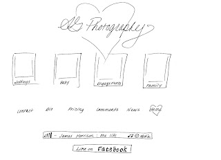
AG Photography Portfolio_webiste
Friday, December 14, 2012
Portfolio
This project was alot of fun, because I am using it to actually develop my portfolio for real. So I would really love any input. I think it is effective because I think it will show who I am and give the person some insight to who I am and what style of photography and editing I am capable of.
I am very interested in any feedback you can give me. Thank You!
Saturday, December 1, 2012
Recycling E-Card Final
Front Cover
Inside Page
Back Page
I think this is effective because it is simple, and it reminds people that plastic can go alot farther than the dump. Recycling can extend the life of plastic a long time, and there are alot of ways to reuse plastic. Hope you like it. I look forward to your feedback.
Front Cover: Photo of
landfill, added a slight blur to remove some of the detail of the garbage. Then I added some black and white layer to
the background with a grain. I felt this
helped obscure the photo a bit, still giving you a sense of a landfill, without
all of the details. I added some to the
photo on the right so I had more of an image on the right. I needed more photo. Masked out the background of the bottles, and
added some contrast and lighting to bring attention to them. I also played with the gamma correction on
the bottles a bit. I added a mask over
the big bottle to obscure the brand and drew a face on it, crying. The text I added a slight drop shadow.
The Inside page:
Started with a basic green background. I added a yellow circle with a
faded glow to draw attention to the bottles.
I masked out the background of the bottles and boosted the vibrance a little. I added the thought bubbles with a small
stroke. Found photos of each some
plastic recycled end product to give the consumer ideas of what recycled
bottles can become instead of sitting in a landfill. Each photos has an inside bevel, to give it the
appearance of looking in.
The Back page: I
played around with text size and also added a stroke to the text. I added the recycling chart as a guide to
encourage people to recycle. Then I
added a recycling symbol, with a 50 % opacity, to obscure it a bit.
Hope you like it!
Landfill photo: http://www.budgetdumpster.com/blog/wp-content/uploads/2012/11/landfill-landscape.jpg
recycling E Card
Below are some concepts for the E card. I have decided to go with recycling. We are big into recycling at my house, and it is something everyone can do, and we can make a difference! We just need to promote more how it helps and what it creates.
Monday, November 5, 2012
james morrison book cover
WOW, way to many version to post here, but I will say it was a challenge. I will display some progress pics. These pics were my inspiration:

This is my final version:


This is my final version:

I started with the flowers background and softened it using a overlay. Next I took the photo of James Morrison and masked out everything but his body. I then took the background and placed it on top of the image of his body and masked out some of the image to make it appear like he was in the flowers. Next I took another part of the flowers and and used it to create a shadow on his pants and jacket, so appear like the sun was hitting him. For the James Morrison text, I used the larger letters for the first letters of his name, and then added a satin texture to give them a shine, with a slight stroke, and drop shadow to the pink letters. The satin effect makes it look like light hit them. For the Spine, I took the neck of a guitar with a purple (from the flowers) overlay on it to cover the brown tone and put the name in a black bevel with a white glow. For the back cover I added a soft purple gradient, so that on the edges, the flower background came through a little. I masked out and rotated the guitar and added a shadow. I cut an paste a bar code from an actual book (noted below). Then I took several pieces of his sheet music and rotated them around, and added a shadow to give them depth. The flowers on the front of the guitar are a section from behind, copied again and brought forward. I masked out the background and left only the flower, to sit on the guitar.
I think that this book cover is effective because it shows how sensitive and soft his music is. He does a lot of love songs, and the cover brings you to a beautiful place. I was trying to think "would I buy this?" when I was creating it, but I would just because its james morrison.
References:
Guitar - http://en.wikipedia.org/wiki/Guitar
james-morrison - http://wac.450f.edgecastcdn.net/80450F/popcrush.com/files/2011/12/james-morrison.jpg
you make it real sheet music - http://www.di-arezzo.co.uk/sheet+music/popular+sheet+music/sheet+music-for-voice/AMSCO01306.html
broken strings sheet music - http://www.di-arezzo.co.uk/sheet+music/popular+sheet+music/sheet+music-for-voice/HALLE01649.html
guitar neck - http://www2.gibson.com
Sunday, November 4, 2012
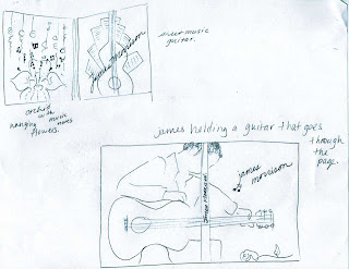
I chose to do my book cover on James Morrison. James Morrison voice is unique and like no other due to a battle with whooping cough. This has made him the passionate artist that he is today. He is an amazing singer/song writer and sings from his sould. Most of his music is sensual and about love. Music teacher told him, he would never be an artist, and his struggle to become one, creates the perfect subject matter for this book. So lets meet James Morrison, by Ashlea Garrand. Here is a start to some of my sketches.
Saturday, October 27, 2012
Final Child Abuse Awareness Poster
Here is my final Awareness poster, I look forward to your comments.

version 2 for Holly with new font suggestion
I will start with how I got there.

Added a black beveled sidebar with a large shadow, putting in text in a vertical format. Then I added a soft gray outer glow to the text.
Next I added a silhouette of a women, and maked the inside to incorporate the abused children to look like a reflection or past images. Once inside the mask, I blended them and dropped them to about 25% opacity. I outline the image the baby at the bottom to give it space. Then I beveled with a hard chisel the silhouetteto make it stand up a little from the background to get this final image.
Child-Abuse-56.jpg, http://topnews.co.uk/images/imagecache/main_image/Child-Abuse-56.jpg
470_947445.jpg, Helping Domestic Violence and Child Abuse Victims in Florida, Today: The Experiences of Hundreds, Thousands, Quite Possibly Millions of Domestic Violence and Child Abuse Victims in Florid, by Heather Inks, Yahoo! Contributor Networkhttp://voices.yahoo.com/helping-domestic-violence-child-abuse-victims-5391051.html?cat=42
55687909.jpg, website: http://heineman18.edu.glogster.com/help-stop-child-abuse/, http://edu.glogster.com/media/6/56/68/79/56687909.jpg
stop-child-abuse-1.jpg, Social Problem: Child Abuse Website: http://claudiavenessa.blogspot.com/p/resources.html

version 2 for Holly with new font suggestion
I will start with how I got there.

I used a gradient background that I created starting at black, then navy and to gray. pulling it down.
Added a black beveled sidebar with a large shadow, putting in text in a vertical format. Then I added a soft gray outer glow to the text.
I cropped out via a mask of the background and feathered the edge to leave a soft border. I left it color to be dramatic. Next I added text around the image and put a horizontal warp on both, making the word Child In caps to stand out.
I look forward to your comments, I hope you like it, I would actually love to use this poster in some way. Ashlea Garrand
Photo Credits:
sleeping baby image, Aussie baby who forgets to breath when sleeping, by Carly Youd
silhouette-woman.png, silhouette of Lynne Davies,board of directors. http://www.duniamarketplace.com/meet-the-board/
Child-Abuse-56.jpg, http://topnews.co.uk/images/imagecache/main_image/Child-Abuse-56.jpg
470_947445.jpg, Helping Domestic Violence and Child Abuse Victims in Florida, Today: The Experiences of Hundreds, Thousands, Quite Possibly Millions of Domestic Violence and Child Abuse Victims in Florid, by Heather Inks, Yahoo! Contributor Networkhttp://voices.yahoo.com/helping-domestic-violence-child-abuse-victims-5391051.html?cat=42
55687909.jpg, website: http://heineman18.edu.glogster.com/help-stop-child-abuse/, http://edu.glogster.com/media/6/56/68/79/56687909.jpg
stop-child-abuse-1.jpg, Social Problem: Child Abuse Website: http://claudiavenessa.blogspot.com/p/resources.html
Thursday, October 18, 2012
Child Abuse - Awareness Poster
The topic that I chose to do my awareness poster is on child abuse.
I have drawn out some concept sketches here, but I am unclear of the direction that I am going with this poster yet. There are so many forms of child abuse and so many angles that I am having trouble picking one.
Sunday, October 7, 2012
Draighean Band Part 2
In starting this project I reviewed over 100 photos of my trip to Ireland. It was a tough choice my I narrowed it down to using the following pictures to create my poster. I needed to also pull in a few stock photos, as I didn't have any good lightning shots or celtic tatoos.
Now to pull it all together.
Work cited:
Lighting photo. dreamstime_m_222073.jpg, http://www.dreamstime.com/
Stormy sky. stormy_sky_12_by_Tash_stock.jpg www.tash-stock.deviantart.com
Celtic Tatoos.
http://www.aon-celtic.com/cgallery/cgallery99.html
Lindisfarne Knot. www.wikimedia.org
Celtic Knot patterns. http://www.marcels-kid-crafts.com/celtic-knot-patterns.html
I had to draw the bands logo because I wasn't happy with any of the fonts, so I drew it scanned it in, cleaned it up in corel draw imported it, and gave it a texture and and outline with a green overlay.
As for the text I added some glow with a slight drop shadow to make it stand out from the background and give it some dimension.
This project was definately alot of work and challenging. I believe that the poster is effective because it clearly shows it is Irish related. It states Celtic Rock and shows an edgy image from the norm. Celtic Rock is a newer rendition of celtic music. I think the castle grabs your attention and the white fonts sends the message. So here is the finished project.
Thursday, October 4, 2012
Draighean Band Poster
I love Irish music, so when we were given the project of a fictitious band it was an easy choice for me. My concept is a poster for this new Celtic Rock Band named Draighean. They are a very high energy rock group with a very Irish twist. Very entertaining and exciting. The poster is being designed for their debut at a large irish pub.
Sketches:
concepts:
Sketches:
Subscribe to:
Comments (Atom)


