Monday, December 17, 2012
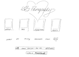
AG Photography Portfolio_webiste
Friday, December 14, 2012
Portfolio
This project was alot of fun, because I am using it to actually develop my portfolio for real. So I would really love any input. I think it is effective because I think it will show who I am and give the person some insight to who I am and what style of photography and editing I am capable of.
I am very interested in any feedback you can give me. Thank You!
Saturday, December 1, 2012
Recycling E-Card Final
Front Cover
Inside Page
Back Page
I think this is effective because it is simple, and it reminds people that plastic can go alot farther than the dump. Recycling can extend the life of plastic a long time, and there are alot of ways to reuse plastic. Hope you like it. I look forward to your feedback.
Front Cover: Photo of
landfill, added a slight blur to remove some of the detail of the garbage. Then I added some black and white layer to
the background with a grain. I felt this
helped obscure the photo a bit, still giving you a sense of a landfill, without
all of the details. I added some to the
photo on the right so I had more of an image on the right. I needed more photo. Masked out the background of the bottles, and
added some contrast and lighting to bring attention to them. I also played with the gamma correction on
the bottles a bit. I added a mask over
the big bottle to obscure the brand and drew a face on it, crying. The text I added a slight drop shadow.
The Inside page:
Started with a basic green background. I added a yellow circle with a
faded glow to draw attention to the bottles.
I masked out the background of the bottles and boosted the vibrance a little. I added the thought bubbles with a small
stroke. Found photos of each some
plastic recycled end product to give the consumer ideas of what recycled
bottles can become instead of sitting in a landfill. Each photos has an inside bevel, to give it the
appearance of looking in.
The Back page: I
played around with text size and also added a stroke to the text. I added the recycling chart as a guide to
encourage people to recycle. Then I
added a recycling symbol, with a 50 % opacity, to obscure it a bit.
Hope you like it!
Landfill photo: http://www.budgetdumpster.com/blog/wp-content/uploads/2012/11/landfill-landscape.jpg
recycling E Card
Below are some concepts for the E card. I have decided to go with recycling. We are big into recycling at my house, and it is something everyone can do, and we can make a difference! We just need to promote more how it helps and what it creates.
Subscribe to:
Comments (Atom)


